
High Quality Project Based Learning (HQPBL) is the first collectively-developed PBL Framework to guide aspiring educators. The goal of this project is to collaboratively create and share a Framework for High Quality Project Based Learning to provide quality and consistency across classrooms, schools, districts and states.
Two Birds was hired to create the HQBPL logo then to design and create the website to host the project framework.
Presented Logo Concepts:
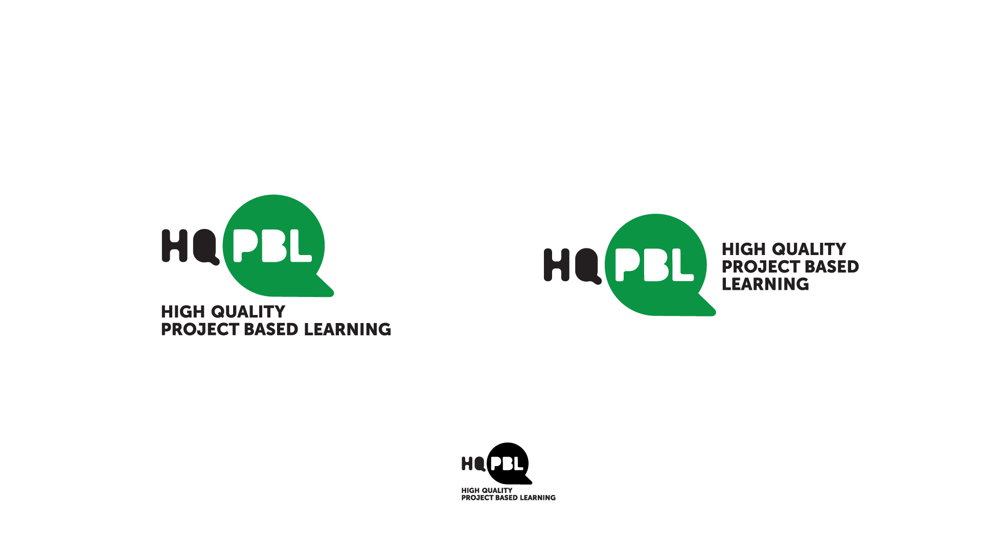
This design concept was inspired by the power skills of collaboration and communication that are among the benefits of project-based learning. The speech bubble is representative of the Q and creates a strong, iconic mark. These options explore the full abbreviation of HQPBL and is paired with the full written text in both horizontal and stacked formats . The logo below shows how it works in one color and when it is reduced to a very small size.
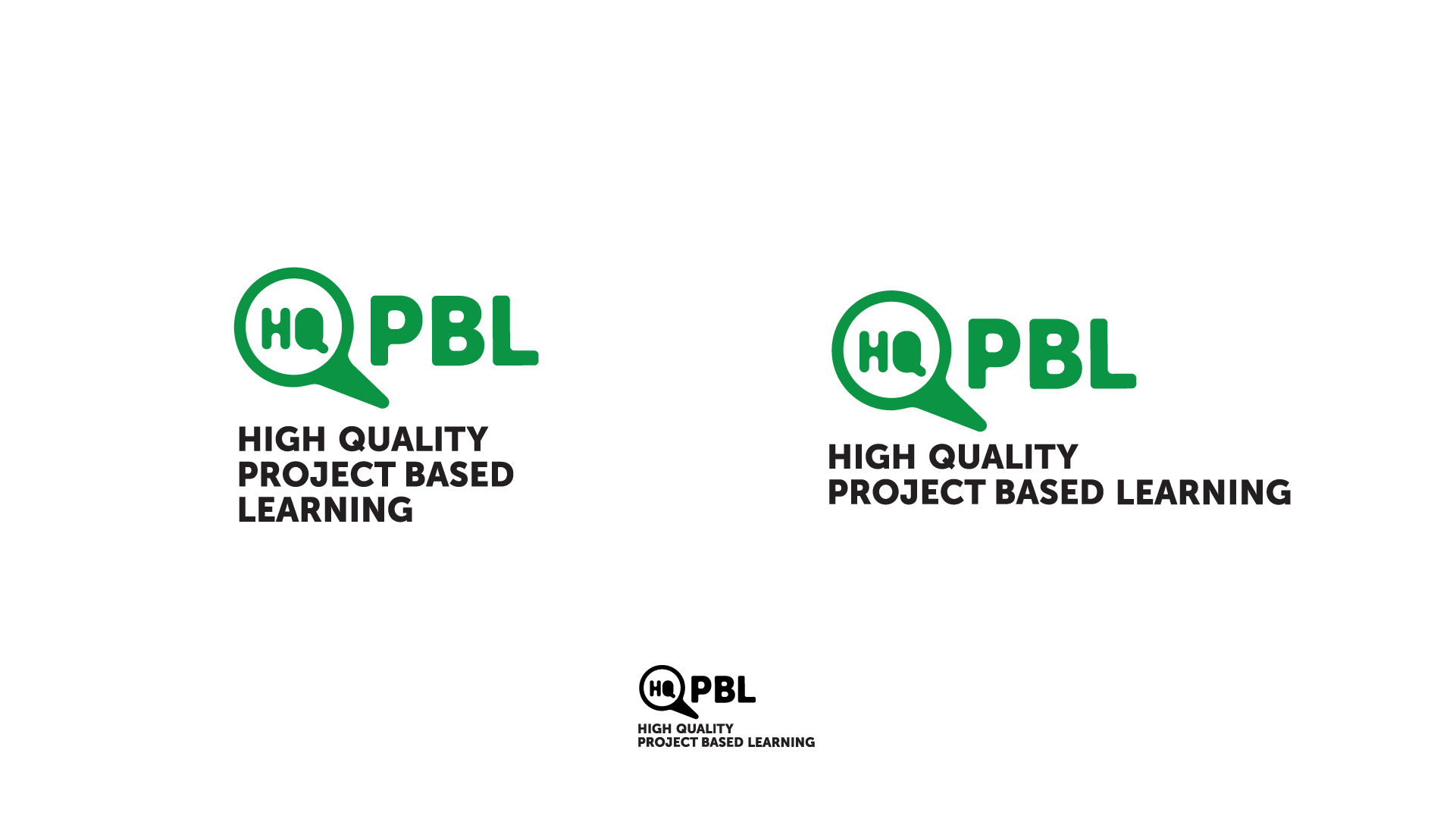
Similar to the first concept , this design concept was also inspired by collaboration and communication. The student designer discovered that the speech bubble also looks like a magnifying glass, which represents curiosity and exploration.
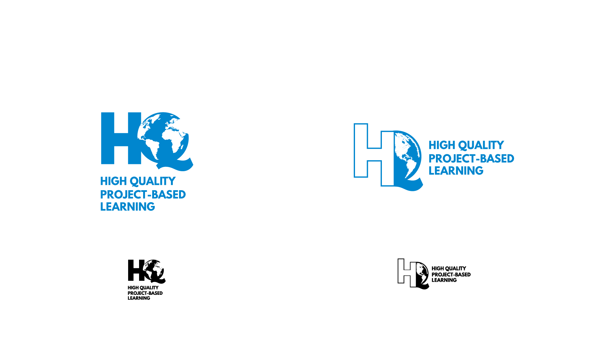
Given the relatively long brand name, the student designer of this concept felt passionately about creating a mark that focused on HQ as an iconic brand. The student took an existing sketch and incorporated the feedback we received to include an earth or a globe.
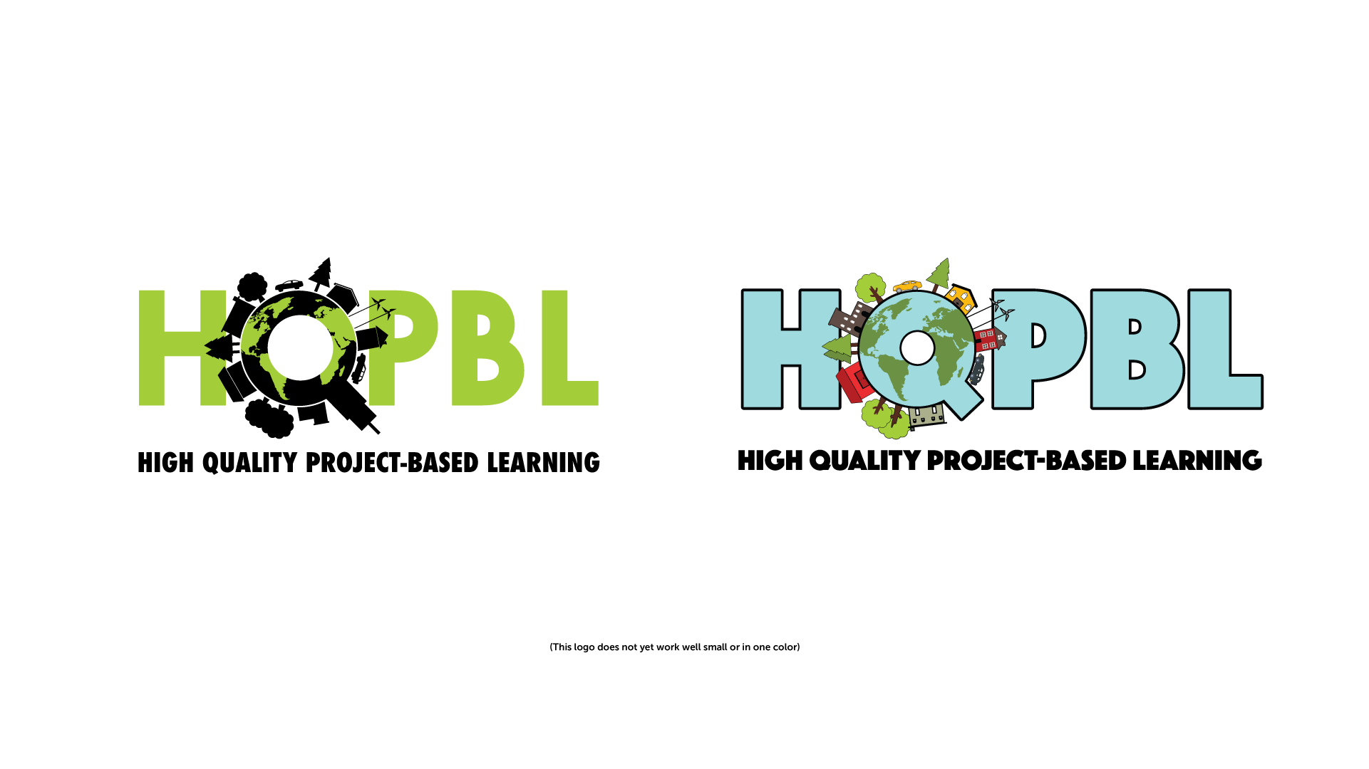
This concept was sketched and conceived by an elementary student who often visits Two Birds. Our student leaders are a little reluctant to show this design because it has some challenges that would need to be addressed should it be selected. For example, it doesn’t scale down well because of its intricacy. However, they felt the idea has merit and is worth sharing.
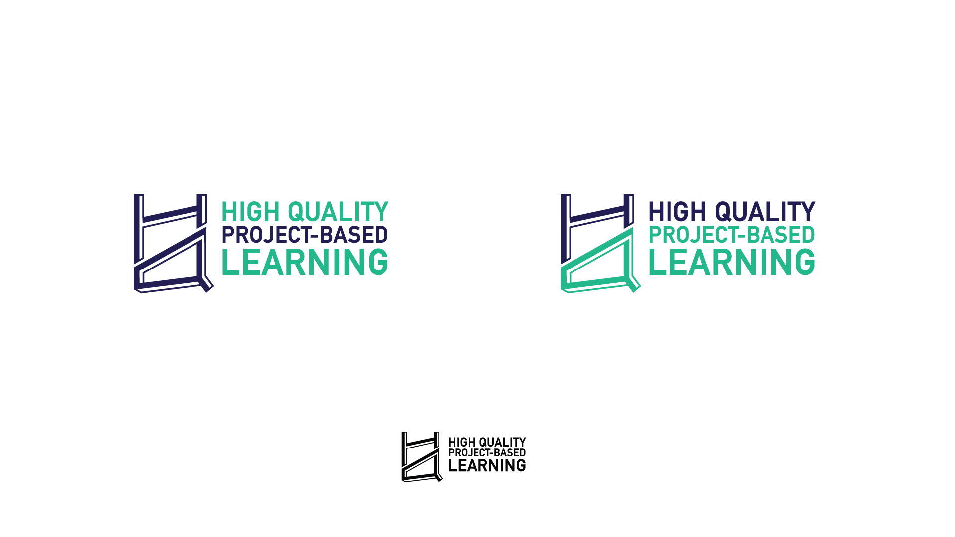
This concept is the finished design of one of the rough sketches we initially provided. Though it does not include an obvious symbol like an earth or globe, it is heavily inspired by project-based learning. PBL promotes creativity, reframing problems and finding solutions. This abstract maze-like HQ is reminiscent of the wildly-creative work of M.C. Escher, and represents the new perspectives and outlooks that students gain on the world when engaged with project-based learning.
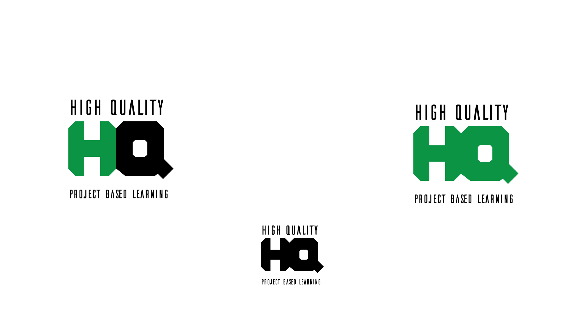
Another finished design of a rough sketch, this concept is a clean, modern and simplistic take on the HQ.
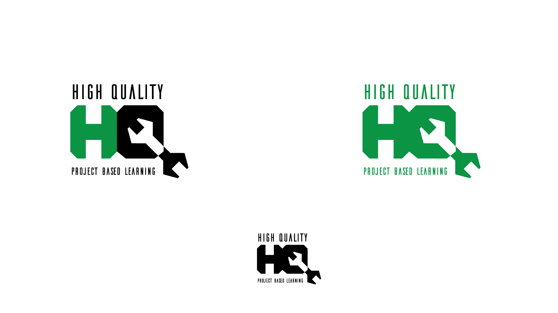
The concept came about as we explored ways to incorporate conceptual representations of project-based learning. Many students were inspired by tools as symbols of PBL and the angles of a wrench work extremely well when incorporated into the Q. Tools are powerful images of PBL because students develop the skills needed to problem solve by building, creating, tinkering, and fixing the world around them.
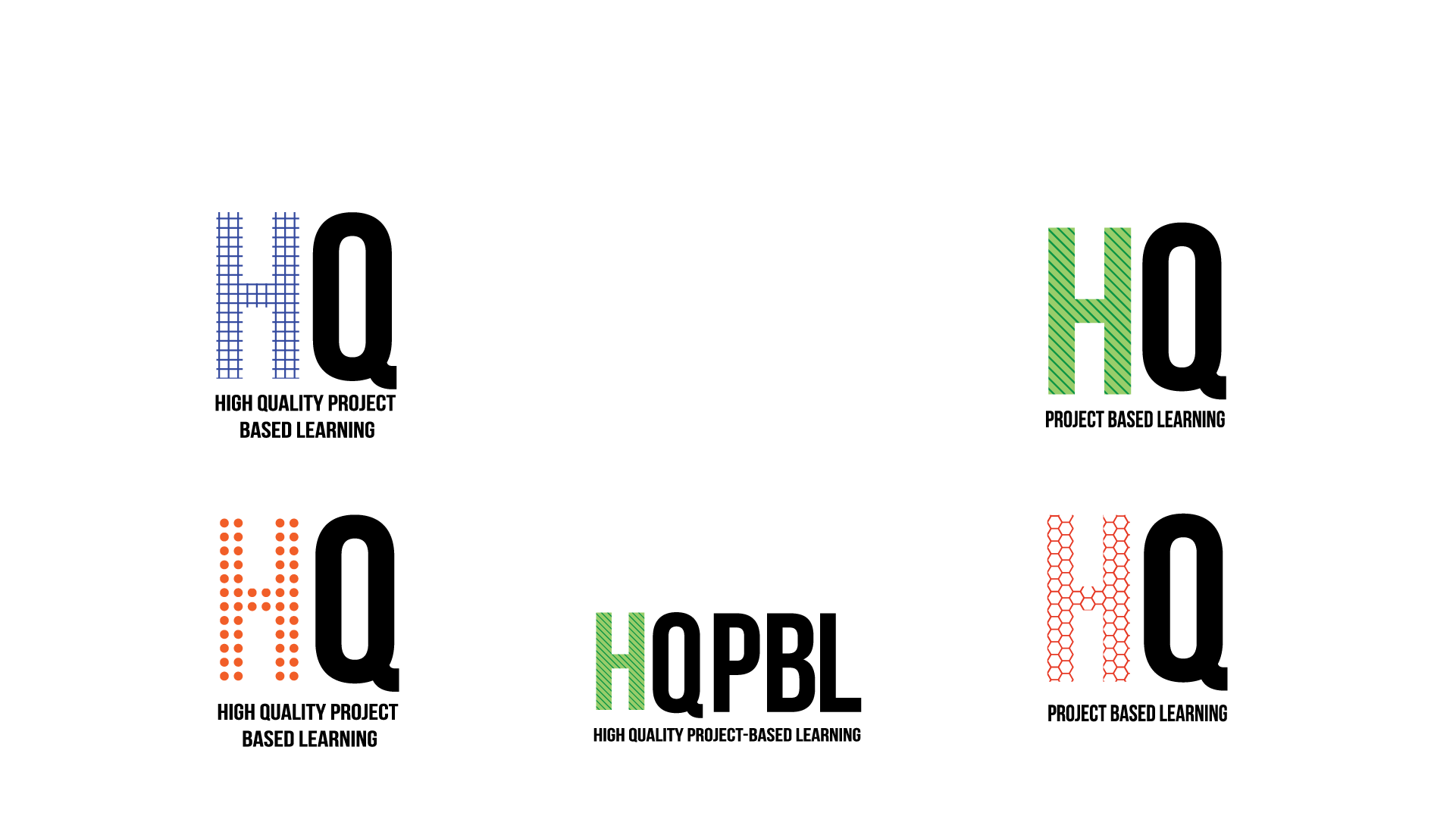
This concept is the completed version of the identity system presented in our initial sketches. As an identity system, the designer of these logos envisions all of them being used together at different times and places — or perhaps at the same time as an animated gif that flashes all of the various H’s quickly before the user. What’s the inspiration here? That project-based learning is fun, colorful, inspiring, innovative, modern and unexpected. It's textural, graphic and visually stimulating. The student designer chose to focus how HQ and HQPBL could all work together depending on the execution.
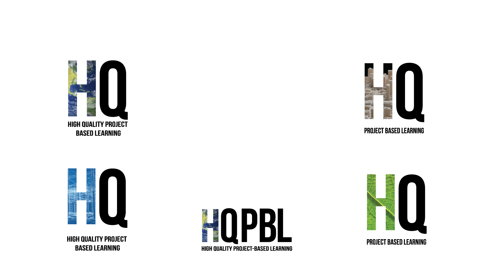
Inspired by the previous concept, these logos use photography in the H instead of vector patterns. It is equally fun and exciting, just in a different way.


